Astroネイティブなshadcn/ui、「Starwind UI」を使ってみた
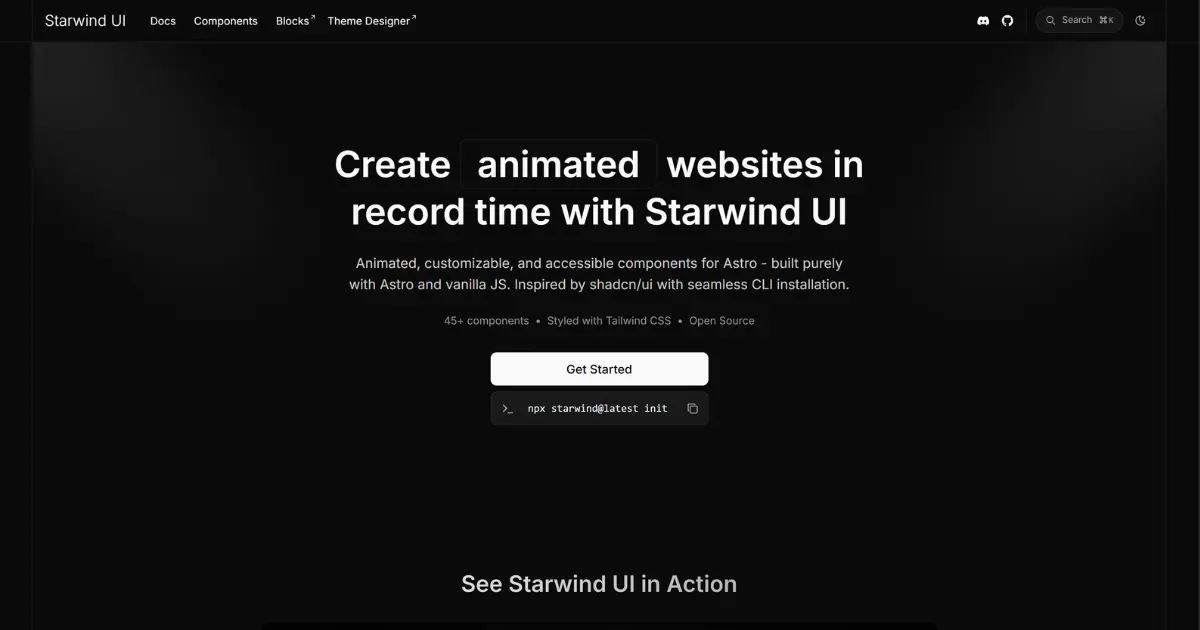
AstroにAstro以外のUIライブラリを追加不要なshadcn/uiライクのUIライブラリ「Starwind UI」を紹介します
目次
#React不要で使えるshadcn/ui代替の需要
Astroでshadcn/uiを使うためには、Reactを依存関係に追加しなければならず、少し抵抗がありました。Astro上に別のUIライブラリを導入すると、そのライブラリのクライアントランタイムを同梱しなければならなくなります。
そんな時、RedditでStarwind UIというライブラリがおすすめされているのを見つけました。
#導入方法
公式ドキュメント
Note
公式にMCPサーバーが提供されており、starwind_init や starwind_add などのツールを通じて、LLM(AI)から直接プロジェクトへ導入・コンポーネント追加を行うことも可能です。(筆者は手動で導入しました)
基本的にドキュメント通りに進めていけば問題ありませんし、shadcnとコマンドの使い方も変わりません。(ドキュメントのパッケージマネージャーにbunが無くて🤔 もちろんbunxでも動きました)
#初期セットアップ
npx starwind@latest init
┌   Welcome to the Starwind CLI│◇  What is your components directory?│  src/components│◇  Where would you like to add the Tailwind .css file?│  src/styles/starwind.css│◇  What Tailwind base color would you like to use?│  Neutral (default)│◇  Select your preferred package manager│  npm│◇  Install tailwindcss@^4, @tailwindcss/vite@^4, @tailwindcss/forms@^0.5, tw-animate-css@^1, tailwind-variants@^3, tailwind-merge@^3, @tabler/icons@^3 using npm?│  Yes│◇  Packages installed successfully│◇  Created project structure│◇  Astro config setup completed│◇  TypeScript path aliases configured│◇  Created Tailwind configuration│◇  CSS import added to layout│◇  Updated project starwind configuration│◇  Next steps ─────────────────────────────────────────────────────╮│                                                                  ││  Make sure your layout imports the src/styles/starwind.css file  ││                                                                  │├──────────────────────────────────────────────────────────────────╯│└  Enjoy using Starwind UI 🚀
次に、レイアウトファイルでインポートします。
---import "@/styles/starwind.css";---#手動の場合
- tsconfig.jsonを編集する
shadcnと同じように、pathsを設定する必要があります。
{ // ... "compilerOptions": { "baseUrl": ".", "paths": { "@/*": ["src/*"], } }}- プロジェクトのルートに
starwind.config.jsonを作成します。
{ "$schema": "https://starwind.dev/config-schema.json", "tailwind": { "css": "src/styles/starwind.css", "baseColor": "neutral", "cssVariables": true }, "componentDir": "src/components", "components": []}- 必要な依存関係を追加します。
Note
tailwindは、npx astro add tailwindで追加したほうが早いと思います。tailwindcss,@tailwindcss/viteが追加されて、astro.config.mjs等に自動で追加されます。それ以外は自分で導入しましょう。
一応ドキュメントどおりの手順を載せておきます。
npm install tailwindcss@^4 @tailwindcss/vite@^4 @tailwindcss/forms@^0.5 tw-animate-css@^1 tailwind-variants@^3 tailwind-merge@^3 @tabler/icons@^3astro.config.mjsに@tailwindcss/viteを追加します。
import { defineConfig } from 'astro/config';import tailwindcss from "@tailwindcss/vite";
export default defineConfig({ vite: { plugins: [tailwindcss()], },})- 基本的なCSSファイルを作成します。
CSSの詳細
@import "tailwindcss";@import "tw-animate-css";@plugin "@tailwindcss/forms";@custom-variant dark (&:where(.dark, .dark *));
@theme {  --animate-accordion-down: accordion-down 0.2s ease-out;  --animate-accordion-up: accordion-up 0.2s ease-out;
  @keyframes accordion-down {    from {      height: 0;    }    to {      height: var(--starwind-accordion-content-height);    }  }
  @keyframes accordion-up {    from {      height: var(--starwind-accordion-content-height);    }    to {      height: 0;    }  }}
@theme inline {  --color-background: var(--background);  --color-foreground: var(--foreground);  --color-card: var(--card);  --color-card-foreground: var(--card-foreground);  --color-popover: var(--popover);  --color-popover-foreground: var(--popover-foreground);  --color-primary: var(--primary);  --color-primary-foreground: var(--primary-foreground);  --color-primary-accent: var(--primary-accent);  --color-secondary: var(--secondary);  --color-secondary-foreground: var(--secondary-foreground);  --color-secondary-accent: var(--secondary-accent);  --color-muted: var(--muted);  --color-muted-foreground: var(--muted-foreground);  --color-accent: var(--accent);  --color-accent-foreground: var(--accent-foreground);  --color-info: var(--info);  --color-info-foreground: var(--info-foreground);  --color-success: var(--success);  --color-success-foreground: var(--success-foreground);  --color-warning: var(--warning);  --color-warning-foreground: var(--warning-foreground);  --color-error: var(--error);  --color-error-foreground: var(--error-foreground);  --color-border: var(--border);  --color-input: var(--input);  --color-outline: var(--outline);
  --radius-xs: calc(var(--radius) - 0.375rem);  --radius-sm: calc(var(--radius) - 0.25rem);  --radius-md: calc(var(--radius) - 0.125rem);  --radius-lg: var(--radius);  --radius-xl: calc(var(--radius) + 0.25rem);  --radius-2xl: calc(var(--radius) + 0.5rem);  --radius-3xl: calc(var(--radius) + 1rem);
  --color-sidebar: var(--sidebar-background);  --color-sidebar-foreground: var(--sidebar-foreground);  --color-sidebar-primary: var(--sidebar-primary);  --color-sidebar-primary-foreground: var(--sidebar-primary-foreground);  --color-sidebar-accent: var(--sidebar-accent);  --color-sidebar-accent-foreground: var(--sidebar-accent-foreground);  --color-sidebar-border: var(--sidebar-border);  --color-sidebar-outline: var(--sidebar-outline);}
:root {  --background: var(--color-white);  --foreground: var(--color-neutral-950);  --card: var(--color-white);  --card-foreground: var(--color-neutral-950);  --popover: var(--color-white);  --popover-foreground: var(--color-neutral-950);  --primary: var(--color-blue-700);  --primary-foreground: var(--color-neutral-50);  --primary-accent: var(--color-blue-700);  --secondary: var(--color-fuchsia-700);  --secondary-foreground: var(--color-neutral-50);  --secondary-accent: var(--color-fuchsia-700);  --muted: var(--color-neutral-100);  --muted-foreground: var(--color-neutral-600);  --accent: var(--color-neutral-100);  --accent-foreground: var(--color-neutral-900);  --info: var(--color-sky-300);  --info-foreground: var(--color-sky-950);  --success: var(--color-green-300);  --success-foreground: var(--color-green-950);  --warning: var(--color-amber-300);  --warning-foreground: var(--color-amber-950);  --error: var(--color-red-700);  --error-foreground: var(--color-neutral-50);  --border: var(--color-neutral-200);  --input: var(--color-neutral-200);  --outline: var(--color-neutral-400);  --radius: 0.625rem;
  /* sidebar variables */  --sidebar-background: var(--color-neutral-50);  --sidebar-foreground: var(--color-neutral-950);  --sidebar-primary: var(--color-blue-700);  --sidebar-primary-foreground: var(--color-neutral-50);  --sidebar-accent: var(--color-neutral-100);  --sidebar-accent-foreground: var(--color-neutral-900);  --sidebar-border: var(--color-neutral-200);  --sidebar-outline: var(--color-neutral-400);}
.dark {  --background: var(--color-neutral-950);  --foreground: var(--color-neutral-50);  --card: var(--color-neutral-900);  --card-foreground: var(--color-neutral-50);  --popover: var(--color-neutral-800);  --popover-foreground: var(--color-neutral-50);  --primary: var(--color-blue-700);  --primary-foreground: var(--color-neutral-50);  --primary-accent: var(--color-blue-400);  --secondary: var(--color-fuchsia-700);  --secondary-foreground: var(--color-neutral-50);  --secondary-accent: var(--color-fuchsia-400);  --muted: var(--color-neutral-800);  --muted-foreground: var(--color-neutral-400);  --accent: var(--color-neutral-700);  --accent-foreground: var(--color-neutral-100);  --info: var(--color-sky-300);  --info-foreground: var(--color-sky-950);  --success: var(--color-green-300);  --success-foreground: var(--color-green-950);  --warning: var(--color-amber-300);  --warning-foreground: var(--color-amber-950);  --error: var(--color-red-800);  --error-foreground: var(--color-neutral-50);  --border: --alpha(var(--color-neutral-50) / 10%);  --input: --alpha(var(--color-neutral-50) / 15%);  --outline: var(--color-neutral-500);
  /* sidebars variables */  --sidebar-background: var(--color-neutral-900);  --sidebar-foreground: var(--color-neutral-50);  --sidebar-primary: var(--color-blue-700);  --sidebar-primary-foreground: var(--color-neutral-50);  --sidebar-accent: var(--color-neutral-800);  --sidebar-accent-foreground: var(--color-neutral-100);  --sidebar-border: var(--color-neutral-800);  --sidebar-outline: var(--color-neutral-600);}
@layer base { * { @apply border-border outline-outline/50; } body { @apply bg-background text-foreground scheme-light dark:scheme-dark; } button { @apply cursor-pointer; }}#コンポーネントの追加
shadcnと同じようにaddコマンドでコンポーネントを追加できます。
npx starwind@latest add button#コンポーネントの利用
---import { Button } from "@/components/starwind/button";---
<!-- ... --><Button>Button</Button>#実際にサイト構築で使ってみた所感
本サイトの制作でも、ボタンやモバイルナビゲーションメニューにStarwind UIを採用しました。動作が非常に軽快で、初期状態のデザインも洗練されています。shadcn/uiと同様にコンポーネントのコード自体が手元に配置されるため、CSSやマークアップのカスタマイズも容易です。
コンポーネント総数は本家shadcn/uiに比べると発展途上1ですが、主要なUIパーツは一通り揃っており、実用上十分な手応えを得られました。
#結論:Astroの軽量性を損なわずにモダンUIを組める
今回は、Astroネイティブでshadcn/uiライクに使える「Starwind UI」の導入方法と簡単な使い方をご紹介しました。
Astroはデフォルトでクライアントサイドのランタイムを持たず、必要なコンポーネントだけをIslandとしてHydrateできるのが強みです。Starwind UIなら、純粋な .astro コンポーネントとしてCLIから必要なコードのみを追加できます。
外部フレームワークへの不要な依存を増やさず、Astro本来の「軽量さ」を保ったままモダンなUIを構築できる点が大きな強みです。
shadcn/uiの手触りを保ったままAstroのパフォーマンスを最大限に引き出せるため、Astro + Tailwind CSSのプロジェクトに強くおすすめしたいライブラリです。
#Footnotes
-
記事執筆時点: shadcn: 59コンポーネント, starwind: 46コンポーネント ↩